
Creating a Rich Text Editor with Quill, Stimulus and Tailwind CSS
Adding rich text editors to a project has a long history of friction and frustration in development. Whenever I’m asked to add a text editor, I naturally do whatever I can do to avoid them completely. That, or make sure I do extra meditation in preparation for weeks of pain. Most problems range from plugins either doing too much - where it’s difficult to dissect into doing just what you need or doing too little finding yourself writing a bunch of extra code just to make it work for your project.
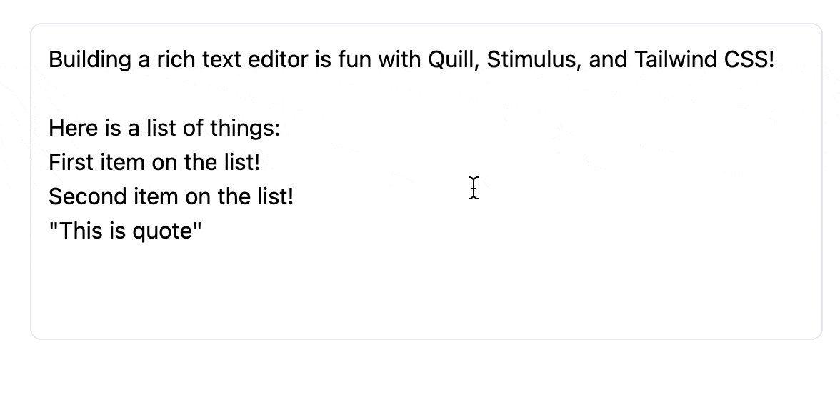
With a recent Ruby on Rails project, I found a nice solution that’s working quite well so far. I found Quill while searching for open source rich text editors. On the Readme file, it says a modern rich text editor built for compatibility and extensibility which is exactly what I’m looking for. In this post, I’m going to use Stimulus and Tailwind CSS to build a text editor that uses minimial javascript and looks natural in our application. In other words, it will look like we’ve build an editor from scratch. Check it out:
 Quill’s file size is 47kb compressed and minified which is not too bad. I’m
using Yarn in my project so installing is a simple as
Quill’s file size is 47kb compressed and minified which is not too bad. I’m
using Yarn in my project so installing is a simple as yarn add quill. Let’s
create a Stimulus controller called rich_editor_controller.s:
import { Controller } from "stimulus";
import Quill from 'quill';
import "./editor.scss"

export default class extends Controller {

  static targets = ['container', 'hidden', 'toolbar', 'form'];

  connect() {
    this.quillInit();
  }

  /**
   * Fire up quill wyswig editor
   */
  quillInit() {
    const quill = new Quill(this.containerTarget, this.quillOption);
    let _this = this;

    // While we type, copy the text to our hidden form field so it can be saved.
    quill.on('text-change', function(delta) {
      _this.hiddenTarget.value = quill.root.innerHTML;
    });

    // Capture focus on and off events
    quill.on('selection-change', function(range, oldRange, source) {
      if (range === null && oldRange !== null) {
        _this.onFocusOut();
      } else if (range !== null && oldRange === null)
        _this.onFocus();
    });
  }

  /**
   * Fires when the editor receives focus
   */
  onFocus() {
    // Add a border and reveal the toolbar
    this.element.classList.add("border-gray-200");
    this.toolbarTarget.classList.add("opacity-100");
  }

  /**
   * Fires when the editor loses focus
   */
  onFocusOut() {
    // Hide the border and toolbar
    this.element.classList.remove("border-gray-200");
    this.toolbarTarget.classList.remove("opacity-100");

    // Submit the form to save our updates
    this.formTarget.requestSubmit();
  }

  // Quill configuration options
  get quillOption() {
    return {
      modules: {
        toolbar: this.toolbarTarget
      },
    }
  }
}
This is all the javascript we need to get a basic text editor and with an added bonus of saving our updates to the database by submitting the form whenever the editor loses focus. The above Stimulus controller is performing three main functions:
- Using Quill to convert the text into html and assigning it to a hidden form field.
- Submitting the form when the editor loses focus so our updates are saved.
- Hiding and revealing the text editor controls for a better user experience.
One important things to note, we’re not importing any themes or css from Quill. We’re going to use our own css and icons so our text editor blends in naturally with our application. Let’s create some html for our text editor:
<div data-controller="rich-editor"
     class="border border-white hover:border-gray-200 rounded-lg p-3">

  <%= form_with(model: user, data: {rich_editor_target: 'form'}") do |f| %>
    <%= f.hidden_field user.description, data: { rich_editor_target: "hidden" } %>
    <div class="prose max-w-none" data-rich-editor-target="container">
      <%= raw(user.description) %>
    </div>

    <!-- Toolbar -->
    <div class="divide-x divide-gray-200 opacity-0" data-rich-editor-target="toolbar">
      <button class="editor-toolbar-button ql-bold ">
        <%= inline_svg_tag "bold.svg", class: 'editor-toolbar-icon' %>
      </button>
      <button class="editor-toolbar-button ql-italic">
        <%= inline_icon :italic,'editor-toolbar-icon' %>
      </button>
      <button class="editor-toolbar-button ql-underline">
        <%= inline_svg_tag "underline.svg", class: 'editor-toolbar-icon' %>
      </button>
      <button class="editor-toolbar-button ql-strike">
        <%= inline_svg_tag "strike.svg", class: 'editor-toolbar-icon' %>
      </button>
      <button class="editor-toolbar-button ql-list" value="bullet" type="button">
        <%= inline_svg_tag "bullet_list.svg", class: 'editor-toolbar-icon' %>
      </button>
      <button class="editor-toolbar-button ql-list" value="ordered" type="button">
        <%= inline_svg_tag "ordered_list.svg", class: 'editor-toolbar-icon' %>
      </button>
      <button class="editor-toolbar-button ql-blockquote">
        <%= inline_svg_tag "block_quote.svg", class: 'editor-toolbar-icon' %>
      </button>
      <button class="editor-toolbar-button ql-code-block">
        <%= inline_svg_tag "code_block.svg", class: 'editor-toolbar-icon' %>
      </button>
    </div>
  <% end %>
</div>
As you can see above, we have a hidden form field that will store the html, a
place for the editor itself, and a toolbar. In this case, we’re using our text
editor to allow our users to format a description about themselves. I found some
icons using Icon Duck to build our toolbar with and I’m
using inline_svg to render the
icons inline with the html. By adding Quill specific classes e.g. ql-bold,
ql-italic, ql-blockquote to the buttons, it lets Quill know where to assign
the functions to perform those actions. Our final step is to apply a little
Tailwind CSS to editor.scss that will style our text.
.ql-container {
  @apply whitespace-pre-wrap p-0;

  ol {
    @apply list-inside list-decimal py-3;
  }

  ul {
    @apply list-inside list-disc py-3;
  }

  blockquote {
    @apply bg-gray-50 border-l border-indigo-200 p-2;
  }

  pre {
    @apply bg-gray-50 p-2 my-2 text-sm;
  }
}

@layer components {
  .editor-toolbar-button {
    @apply hover:bg-gray-100 rounded-md p-2;

    &.ql-active {
      @apply bg-gray-100;
    }

  }
  .editor-toolbar-icon{
    @apply w-3 h-3 text-gray-400
  }
}
We now have a pretty good text editor and it looks natural in our application. Next step will be extending the controller to add more features like adding @Mentions and Emojis that I will cover in future posts.